How I Learned to Website
I’ve maintained a personal site on Neocities, a static hosting platform, since 2022. It’s become a big hobby of mine and I’ve become much better at developing it over time.
I was exposed to Neocities in 2022 through Localfool‘s website. On a whim, I made an account myself.
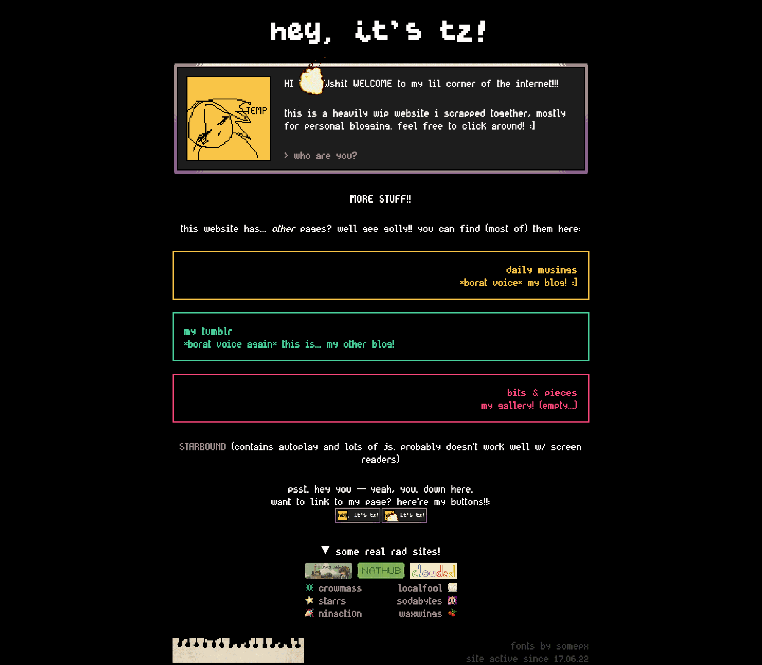
This was the first version of my website, coded on a hotel couch while ill. I was completely unfamiliar with HTML and CSS; I remember the code for the mock-dialogue box at the top was just awful.
Slowly over the next few years, through much scouring of online resources like MDN Web Docs (which still sits buried in my bookmarks bar), I taught myself HTML, CSS, and Javascript. It was fun to just experiment and see what works and what doesn’t.
Iterating
Because I was learning as I went, I iterated a lot and very quickly. What I enjoy most about live web design is that it’s by nature iterative; you’re always playing off previous versions of a page.
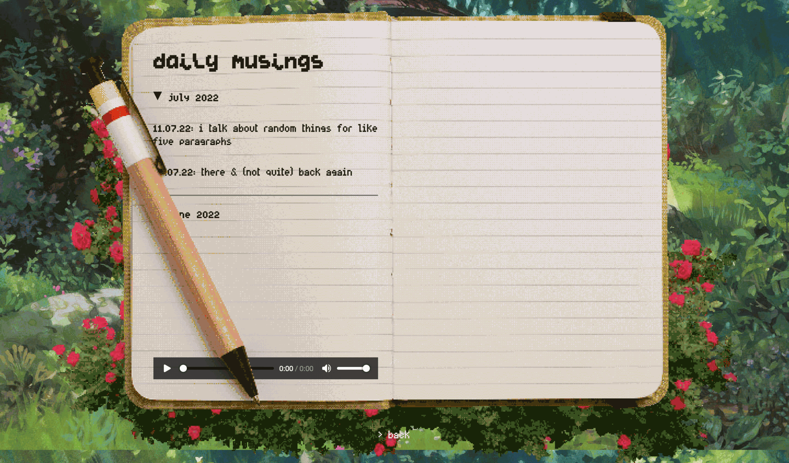
My blog page is probably the best example of this. It has a many-layered history of iteration; I first wrote it right after founding my site and it’s stuck in relatively similar form through every version of my site. You can really see me getting a hang of typography and hierarchy:
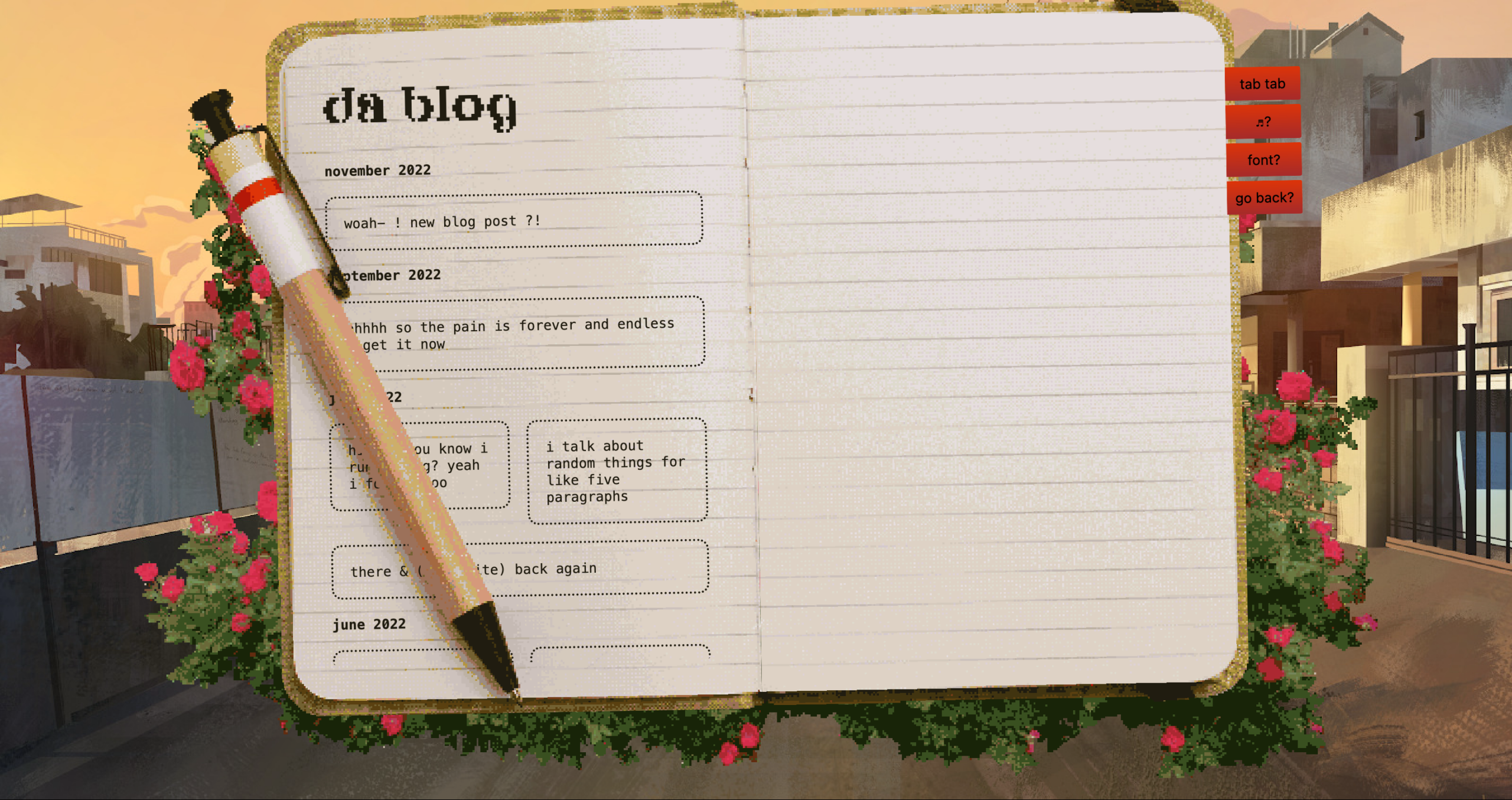
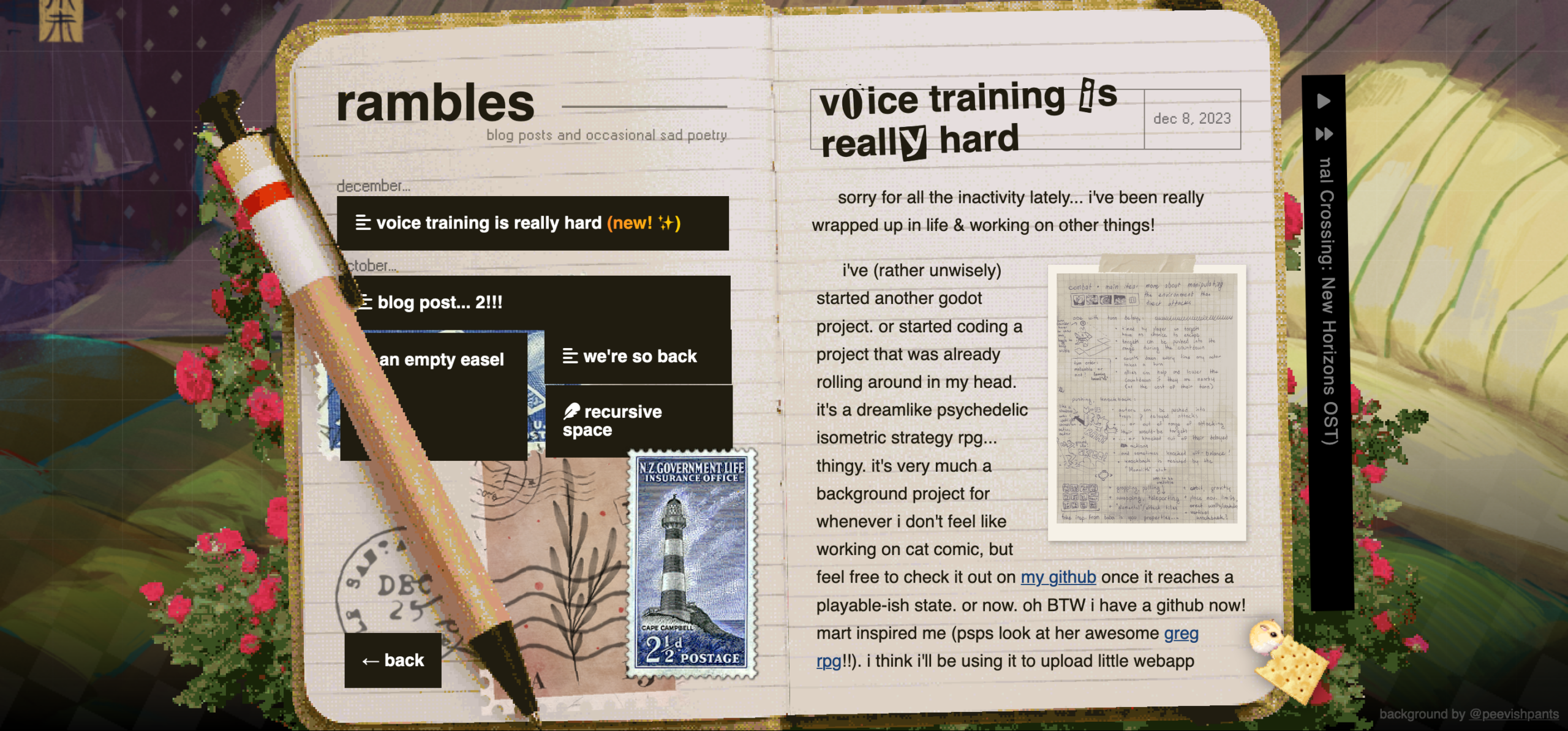
The blog page is still around today; here’s what it looks like now:
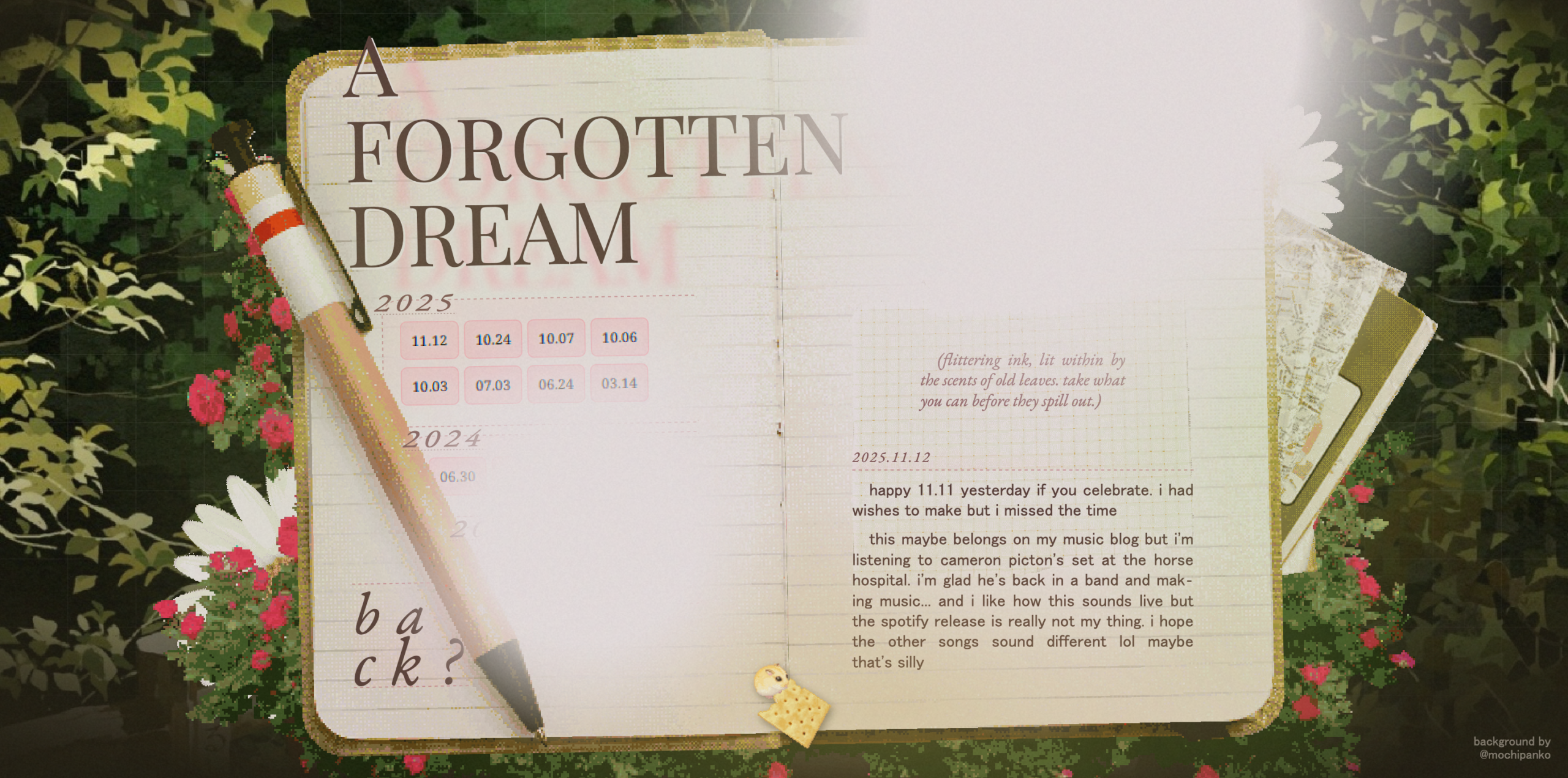
The design gets more and more refined, but you can still hear echoes of the original page.
Narrowing In
Once I had a strong grasp on my tools (and developed a good foundation for design and typography), my page designs became more direct and precise. I had a grasp on design basics; I could treat them more like design projects, drawing specific references from media and other sites.
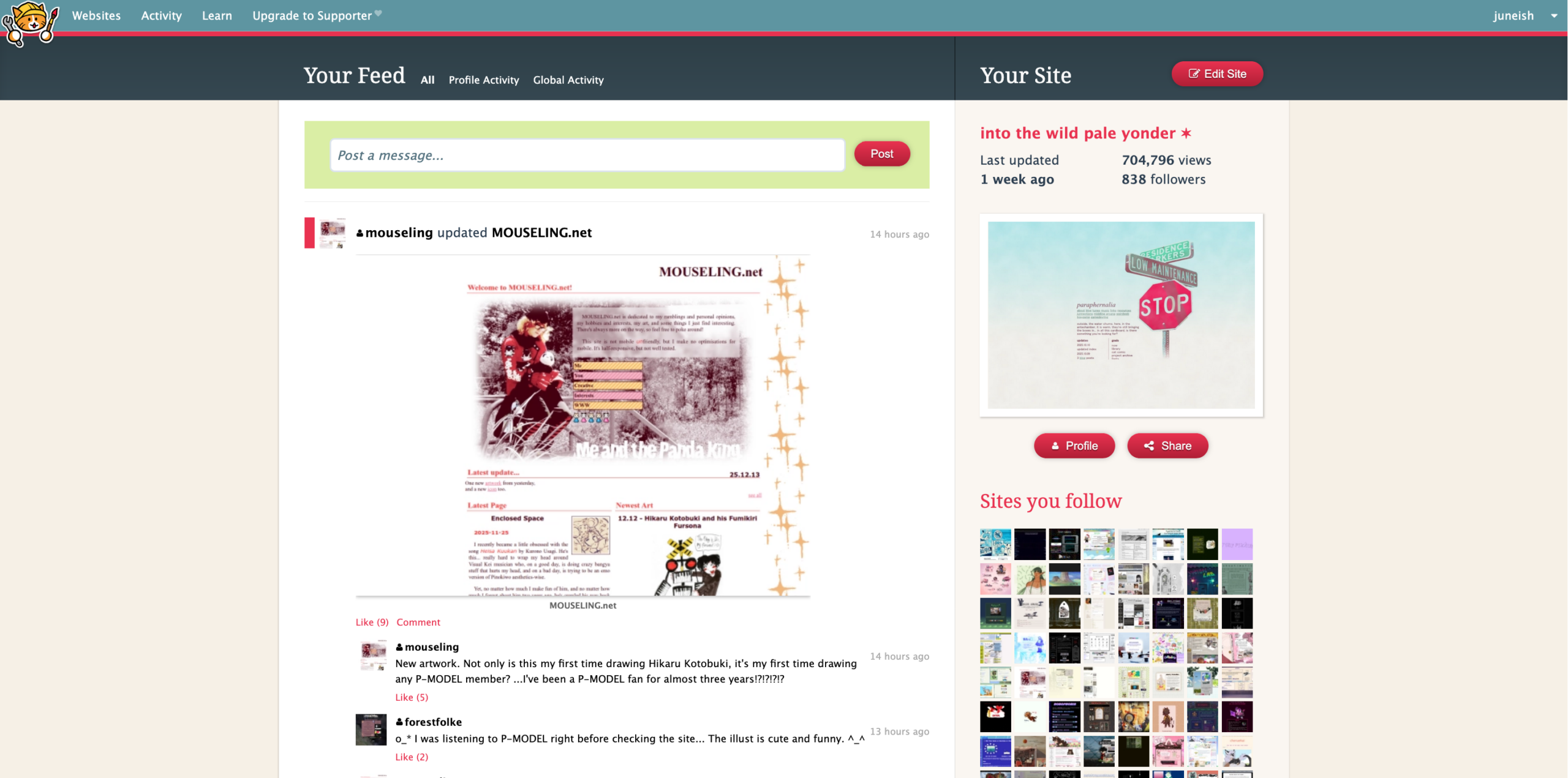
The community aspect of Neocities plays well into this. It has a social feed where you can browse through or follow your fellow site-makers, which is a huge asset when looking for help or inspiration.
Here are two versions of my “about me” page from around the same time. I like these two because despite being written closely after each other, they have very distinct moods and visual identities; they were much more streamlined from conceptualization to implementation.
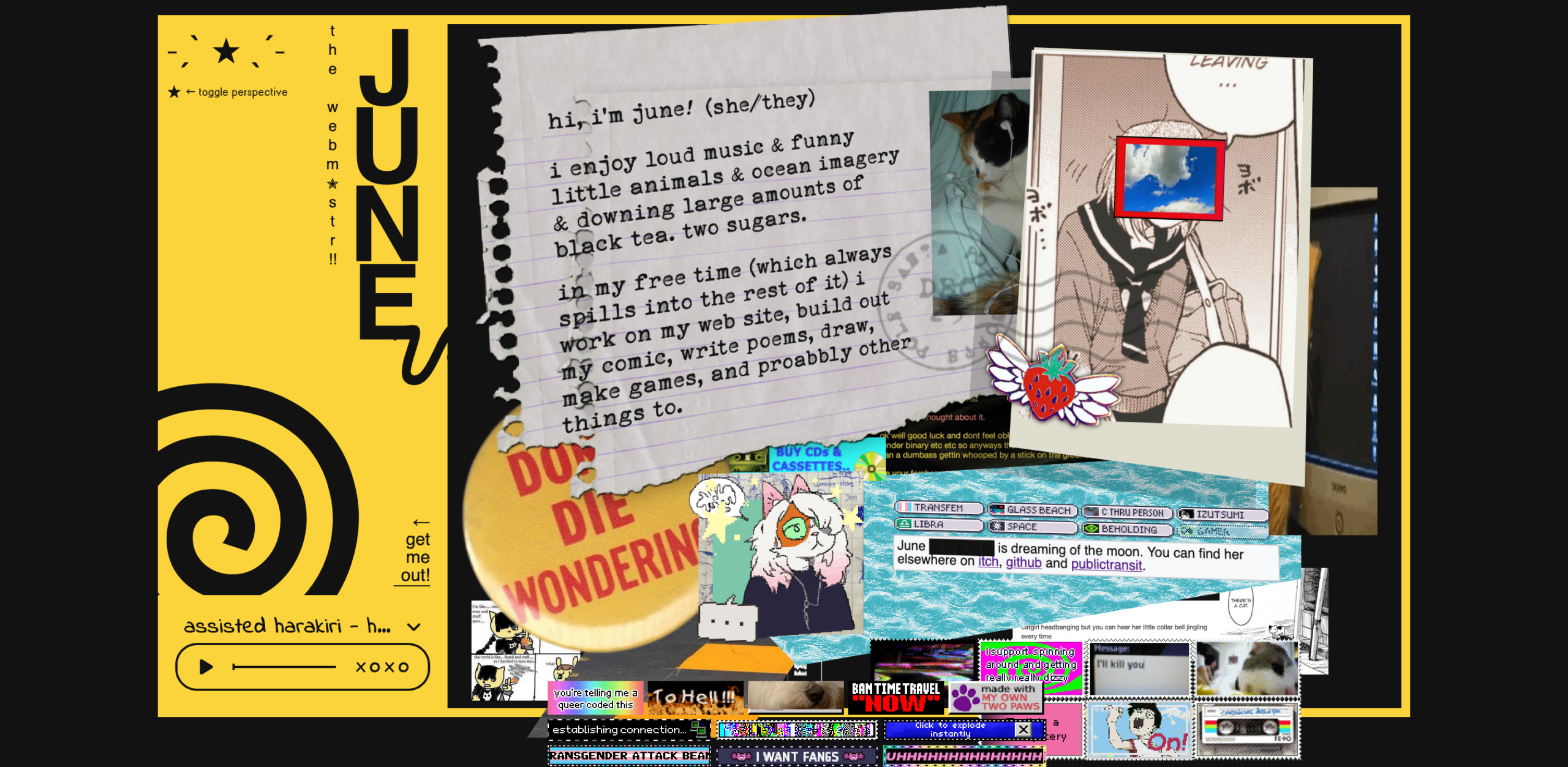
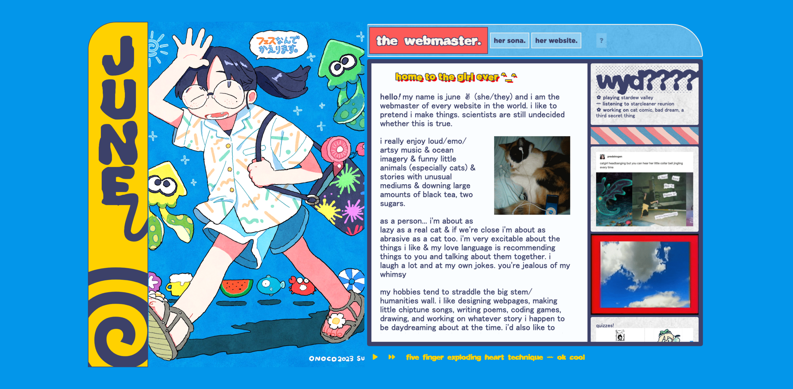
They still iterated on of older designs; the first plays off a similarly scrapbooky design, the second echoes the yellow frame of the first. Still, they’re able to play much further afield much more confidently.

