Designing Communication
In freshman year, I took a graphic design class. Our instructor was a practicing graphic designer, so he instilled in the class a focus on communication with potential clients.
Takeaways
For each project, before working on anything else, we compiled moodboards to convey our visions for the project. Like my classmates, I was initially skeptical of the time we were using solely for moodboards, but over the course of the semester our moodboards became indispensable tools for communicating with each other, our instructor, and even ourselves. They allowed us to understand exactly what it was we wanted to make and put it into words for others.
The peer feedback sessions were a huge part of the class: during each project, we would present our work to each other and pass around criticism. At the start of the class, I was essentially just designing for the instructor, always considering the comments he might give — by the end, I was designing for the class.
Each project tackled a different medium, so we had to familiarize ourselves with those mediums’ purposes and conventions. For one project, we studied the historical context of a stylistic movement and mimiced it in a poster design. For another, we designed flags for fictional locations based on our own research. For another still, we bred two fonts into a set of children and designed a banner for each. I enjoyed the variety; it made me more secure in my artistic versatility.
Final Vinyl
Our final project was to create a 7″ vinyl sleeve for a single we were assigned — in my case, All Things End by Hozier, a song about change.
Our instructor acted as our client, holding one-on-one meetings with us to discuss our work. I presented potential creative directions to him through sets of moodboards and mockups.
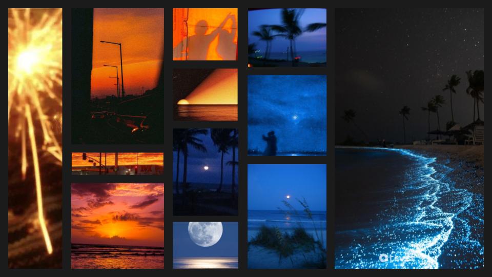
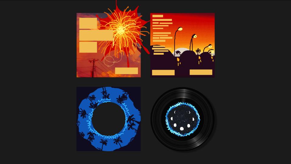
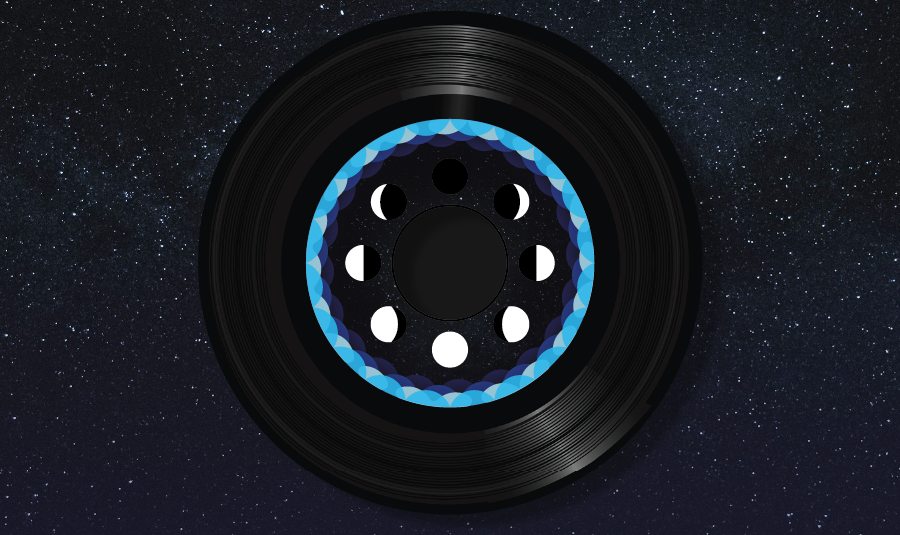
In the first set of ideas, I was focused on day-night cycles as symbols of change and reflection. The exterior of the single was a crimson dusk, and the interior sleeve was a blue nighttime scene. I wanted you to “go through” the setting of the sun as you took out the vinyl. The exterior was intended to be a long road that wrapped around the front and back, “leading you in” to the interior. The center of the vinyl features a moon, using the phases of the moon as a cycle of change. There’s also some minor sparkler/palm-tree silhouette parallels.
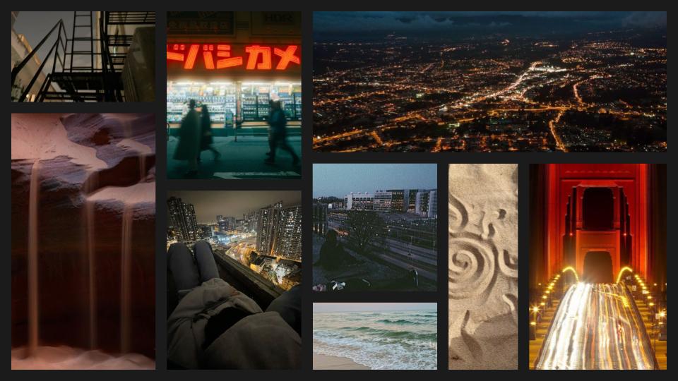
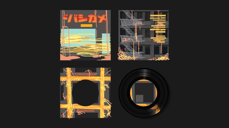
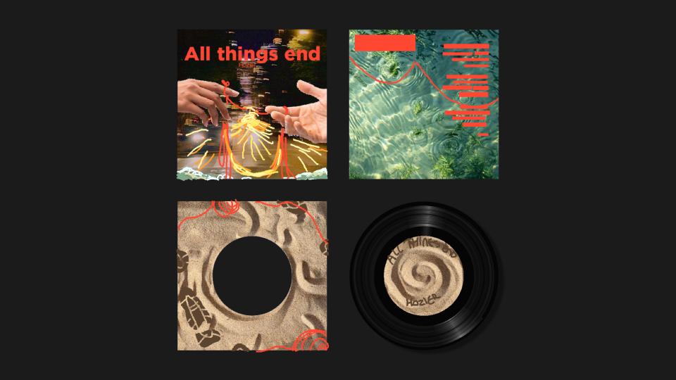
My second set of ideas. The moodboard was themed around long-exposure cityscapes as symbols of change but also of fleeting connection. I liked thinking of the “threads” of light in these long-exposures as a reference to threads of fate, so I included some red strings in the second mockup. I included sea imagery in these cityscapes as a little dash of surrealism, either as sand dripping down over buildings like a huge hourglass or as water flooding underfoot.
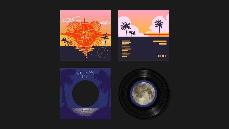
In the end, the instructor and I chose to refine the first mockup of the first moodboard. Here’s how the final result ended up!
Coming back now, I’d definitely saturate and brighten it — a lot of the details, like the text and palm trees on the interior sleeve, are lost in the dimness. I’m very happy with the idea and execution, though!

